Aayush Visualslayover.fig
1AayushOpen to new projects — say helloSelected work

Layover

Brand & Product Design · 2025

A layover is dead time you’ve already paid for. Layover turns it into something usable: enter your airport or PNR and it shows what’s actually open in your terminal right now — order a meal to your gate, or book into a lounge. Built around Indian airports (Delhi, Mumbai, Bengaluru, Hyderabad) and the details that matter there: terminal-aware delivery, veg and non-veg filters as a first-class control, and a live prep timer so you know whether you have time before boarding.

Role
Brand identity · UI · product design
Category
Brand & Product Design
Year
2025
Surfaces
Marketing site, web app, mobile app
Airports
Delhi IGI, Mumbai CSIA, Bengaluru KIA, Hyderabad RGIA
Tools
FigmaPrototyping
Visit Website
Highlights
  • Terminal-aware delivery — every restaurant card carries its pier
  • Veg and non-veg filters promoted to a first-class control
  • Live prep timer, so you know whether you have time before boarding
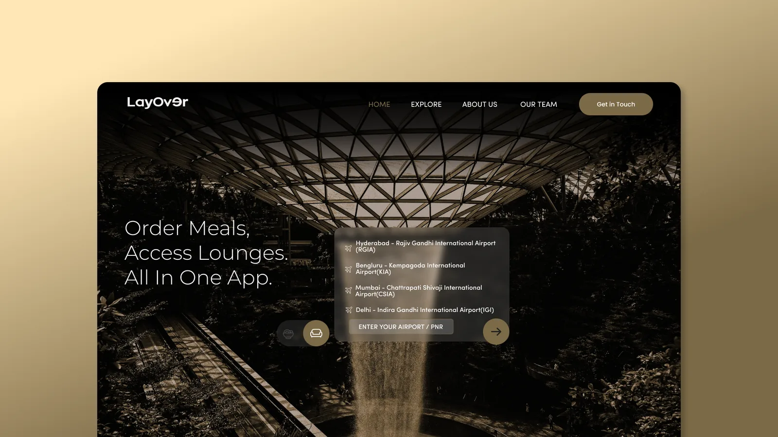
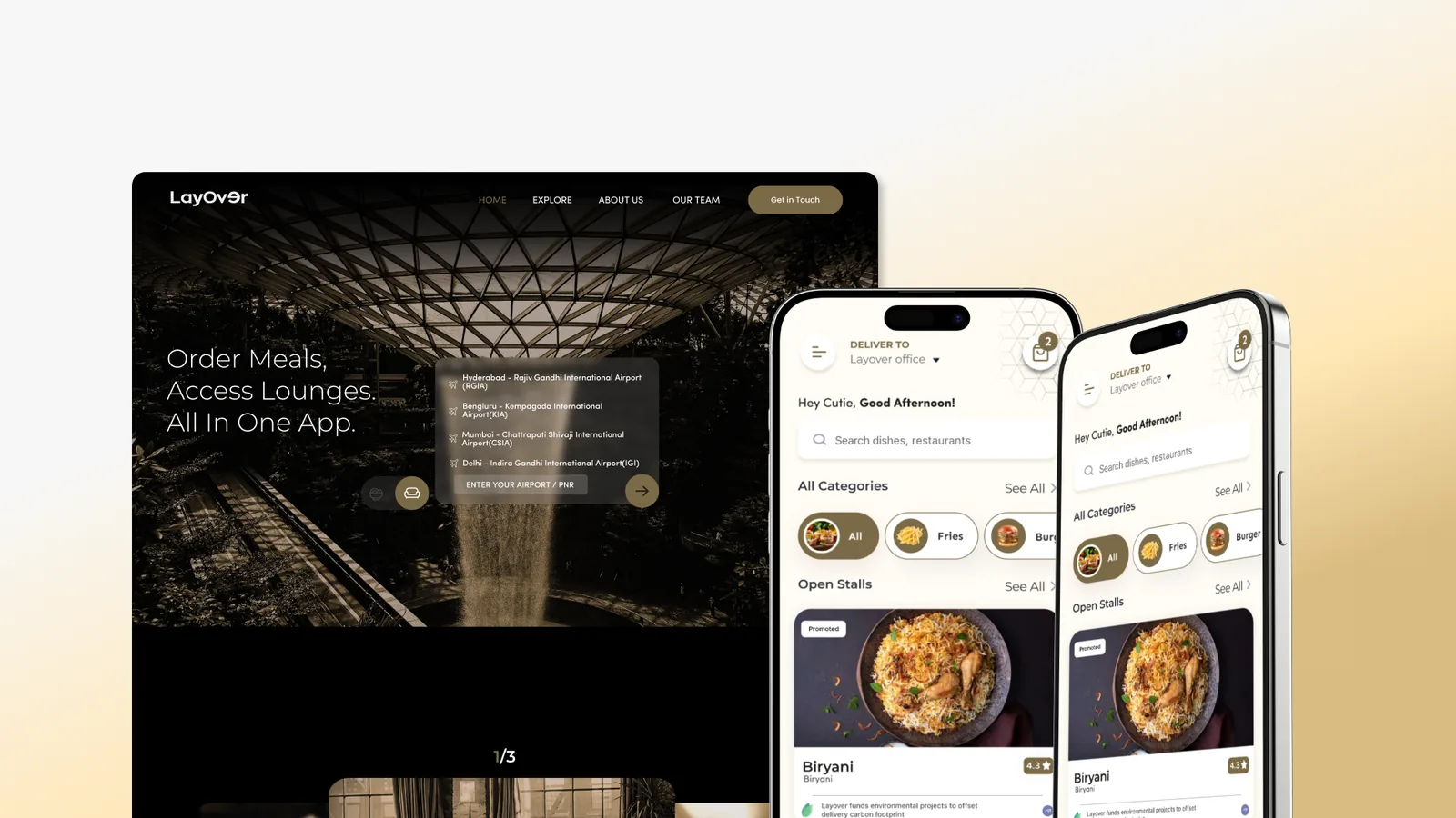
2AayushBuilt with Figma, PrototypingLayover’s landing page over a photograph of an airport atrium, headline “Order Meals, Access Lounges. All In One App.”, with a panel listing Hyderabad RGIA, Bengaluru KIA, Mumbai CSIA and Delhi IGI above a field reading “enter your airport / PNR”.
The landing page. One question — which airport are you in — and the whole product follows from the answer.
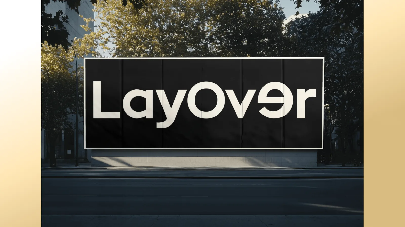
The LayOver wordmark in white on a black billboard on a tree-lined street, the “e” rotated 180 degrees.
The wordmark, with the rotated “e” — a plane turning back on itself, which is the whole idea of a layover in one letter.
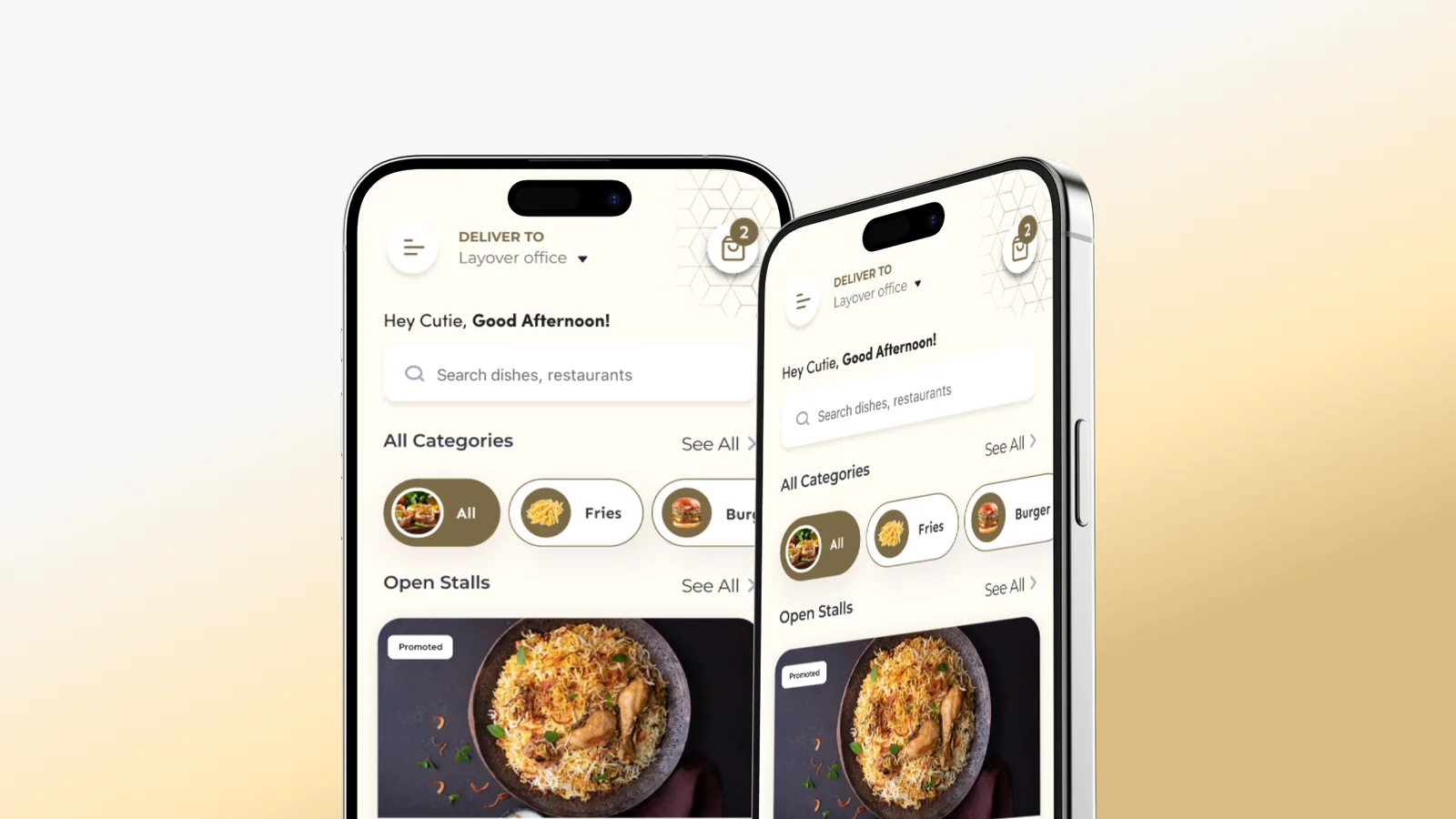
Two phone screens showing Layover’s food ordering interface in cream and gold: a delivery destination of “Layover office”, a greeting, a dish search field, category chips for fries and burgers, and an “Open Stalls” section.
The app’s ordering surface, warm where the marketing site is dark — this is the part you use standing at a gate.
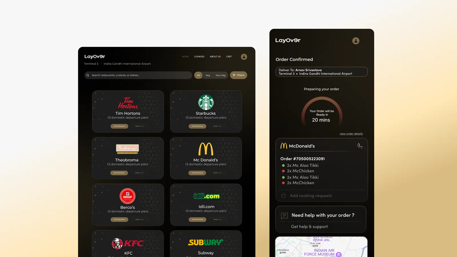
Layover’s restaurant directory on desktop showing Tim Hortons, Starbucks, Theobroma, McDonald’s, Berco’s, Idli.com, KFC and Subway, each labelled “t3 domestic departure piers”, beside a mobile order-confirmed screen with a twenty-minute prep timer, itemised order and a map.
Browse by terminal, then track the order. Every restaurant card carries its pier, because in an airport “where” is the only question that matters.
Layover’s marketing site and mobile app shown together, the dark landing page beside the two cream ordering screens.
Site and app as one system — the dark front door, the warm room behind it.